Editing was once again a very smooth process as I had very little to do after the previous re-editing. The first thing I have changed is the studio name. It has been on my mind for a while that "Big Bang Studios" does not sound like a proper company, so, I have changed it to "Platinum Studios". In my mind, this sounds like a more professional name and is a slight tribute to the creators of one of my favourite video games (Bayonetta), 'Platinum Games'.
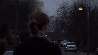
As can be seen above, here is the final edit together of the running sequence. At present, the audio is incomplete, but, that is one of the things that is currently on my list. Overall, the clips fitted alsmost perfectly to the original version so I basically had to slot the new clips over the old ones.After slotting in all of the shots it was necessary to figure out how I was going to make the footage look like it took place at night. In the first draft I had used the Night preset on the Colour Curves and toyed with the brightness and contrast settings but this still did not have the effect hat I wanted. Before this stage in the re-editing I had attempted to use Adobe After Effects to do the Day for Night but it simply did not work. Then I had the idea of using the Night preset twice on each clip and to my surprise it worked perfectly. Now, the footage really looks like it takes place during the middle of the night rather than at dusk but it is still perfectly visible and most of the important details are very clear. This is a very simple, but very effective fix that has drastically improved the quality of my Thriller and makes it appear far more ominous than it initially had.
The final thing to sort out before the audio editing is the one shot that caused a slight change to my timeline. In the first draft, the shot of Katie stopping and turning around was much shorter than the re-shot version. All attempts at cutting the new clip to fit with the old one did not work, so, I cut the timing of the final two shots down greatly and this offsetted the problem. The fast paced editing of the final two shots brings them close to the gun shot sound effect and it really adds to the climax of the sequence.
Not a lot was changed with the audio. I did attempt to have the second line re-dubbed but when it came to editing this line it simply did not fit nicely into the film. It sounded too much as if the line had been re-dubbed and so I left the original line in the edit. I also attempted to fix the footsteps sound effect but this also ended up being a pointless endeavour.
One issue was that my Thriller was far too dark after the new technique. After trying multiple different techniques to increase the brightness I stumbled upon the Levels tool. This allowed me to increase the Gamma on my film and I am glad to say that this fixed my problem with the darkness. While it may still be too dark, there is nothing that I can do to fully fix the problem as I have neither the equipment nor the skills to be able to fix it. Another issue that was brought to my attention during this stage was that the font was not particularly fitting for my Thriller. The intial font was deemed to be too bold and lacked the style that my Thriller exudes. After a bit of searching I came across this font: "Ringbearer" by Pete Klassen. While the font is stylised to look like the one used in the Lord of the Rings (Peter Jackson, 2001-2003) movies I believe that it perfectly fits my Thriller. It is slim, suave and has a certain style to it that really adds to the nature of my Thriller.


 The final scene in my Thriller takes place in a car and initially the footage showed that of a bright and clear day. For the purpose of my thriller this was far too bright and it had no sense of danger lurking behind it. It simply looked like a sunny day in a car.
  This was fixed by changing the brightness and contrast settings. The brightness was decreased to -0.25 and the contrast centre was increased to 1.00. This added a different edge to the sequence as it suddenly become a lot more threatening and a lot more stylised. This works brilliantly for the purposes of my Thriller as the lower brightness sets an unnerving tension for the audience in a highly subtle manner.


