In what ways does your media product use, develop or challenge forms and conventions of real media products?
Earlier in the project I watched a number of other Thrillers and discussed the conventions that they seemed to portray. These included:
• Very simple and quick cuts.
• Takes that are either incredibly long or rather short
• A soundtrack that uses a lot of strings to be eerie, melancholy or epic. Sometimes heavy bass and percussion is used
• Lighting that is used to create incredibly clever shadows. Where shadow is not used, there is usually no lighting to create an incredibly dark scene.
• A setting that is recognisable to the audience.
• A narrative enigma and often have multiple plot twists throughout the movie to keep the audience thinking.
• A crime or something similar around which the narrative can centre itself.
• The theme of victims and villains. Villains are a major force within Thrillers and are usually the main driving force behind the narrative. They are always known to exist, but their true identity or their motive is sometimes hidden from the audience's knowledge until later in the film. The victims are either minor characters whose only role in the movie is their death or they are the protagonist/protagonists as they attempt to escape the villain.
Transitions
After developing my own Thriller I believe that I have used all of these conventions to the best if my abilities. All of the cuts in my movie are incredibly simple and there is at most, one fade. All of these transitions occur incredibly quickly and this is used to add a certain pace to the film to make it more thrilling.
Shot Length
Throughout my opening sequence I do use a variety of shot lengths ranging from the first thirty second shot to the two one second shots at the end of the running sequence.
Lighting
The lighting conventions were interesting as all of my shots were filmed outside. This meant that all lighting was out of my control; however, in the editing stage I made the first sequence appear like it takes place in the middle of the night and the second sequence is darkened to create a stylised look. This miraculously made it match the convention and I am glad that it did because it really adds to the dark tone of the opening.
Setting
The setting of the Thriller is a suburban road and a person’s driveway, both are recognisable to audiences and this brings the sinister nature of the Thriller closer to them.
Narrative Enigma
There are also a number of narrative enigmas in my Thriller that are already hinted at in the opening. First is the question of who the murdered girl is and why she is standing in the middle of the road, then there are questions about who the murderer is and why he is on a murder spree? Finally there are questions about who the protagonist is and what she is doing.
Crime
There is also a crime, a series of murders, that the narrative can centre itself around.
Theme
Finally the theme of victims and villains is also apparent in my opening. Whilst it is not necessarily explicit, it should be obvious to the audience that the murderer is the villain and that the character of Lynette James is a victim.
Even though all of these conventions are met, I cannot say that I aimed to meet all of them. My goal was to make the opening two minutes of a Thriller movie, so I did not need to meet all of them. Also, if it were better for the film to not meet some of the conventions then I would have done so. Even though this is the case, I am glad that I have met all of the conventions that I noticed in both Silence of the Lambs and Memento. One comparison I can make is to The Bourne Identity (Doug Liman, 2002). This also opens in the middle of the night (As seen in the above image) but also places a character in a very unlikely situation as one use of the enigma code. The simple cutting during the running sequence is also similar to that in Silence of the Lambs.
How does your media product represent particular social groups?
My Thriller is meant to represent the young adult age group and as such, all of the characters in my opening sequence are of that age range. The 16-22 year old age range is one that I feel most comfortable in representing as it is the one that I belong to but it is also one that is frequently seen in the news for numerous atrocities. These are mainly stabbings, but there have been some shootings in recent years. This makes for an interesting study as in my film I can portray my view on our age bracket and try to prove that while a very small minority of youths are violent and cruel, the majority of youths are victims to these attacks.
The protagonist of the film is Zoe Moon, a 21 year old Journalism graduate, who is played by Sophie Kish. Sophie is a 21 year old Media Performance student at Glamorgan University and is in her last year and is graduating on the 5th July 2011. This makes her the perfect age and actress for the part as she is closely able to understand the mentality of the character. In the opening, the character of Zoe is dressed in a red shirt, black cardigan and a black skirt although only her top half is seen from inside the car. The red and the black hint at danger, either from her or for her, and they really make her character seem passionate and forceful. The thick-rimmed glasses make the character seem intelligent and suggests that she will eventually figure out the puzzle, they also hint at a clarity of vision that some of the other characters would not have. Overall, this is a really positive representation of the social group as it depicts them to be hard working, bright and very clear minded.
The character of Lynette James is played by Katie Hutchinson, both are 17 year old A-Level students and both have a kind hearted disposition. The character of Lynette is meant to be seen as a victim from the start of the opening to the moment of her murder and this is largely achieved through framing and camera angles. Almost all of the shots of Lynette are mainly filled with background with the character taking up a very small portion of the screen. This makes her look incredibly vulnerable and this is majorly exacerbated in the canted angle in which the villain walks in from screen left. Even though the shot is low angle, the leg of the villain is much larger than the character and this makes her look really weak and in a lot of danger. There are some hints at purity in the character, largely through her costume. The cream coat is the major indicator of this through the connotations of the colour, but the blue scarf adds a certain melancholy to the character through its connotations. Also, the flowing nature of the scarf and by having her hair down adds a certain elegant nature to the character which also adds to the positive image that I am trying to represent.
The villain of the piece, Midnight, is portrayed by Martin Smith. Although only his leg is seen, due to the darkness of the screen, the leg seems so much more imposing. As it is the closest thing to the screen at the time this further adds to the sinister nature of the character. Even though this is about the closest analysis that can be made of the character from the opening sequence, it does show a negative representation of the social group and its violence.
By having two positive representations versus one small negative representation I believe that I am successful in my task of proving that only a small minority of the social group are violent. While this group is never really discussed in film in this manner, it is something that I think would resonate with my audience and would hopefully educate older members of society.
What kind of media institution might distribute your media product and why?
Due to the location and budget of my movie, it would most likely be distributed by an independent film organisation like ‘Warp Films’ who were behind the thriller Dead Man’s Shoes (Shane Meadows, 2004). Most of the companies films are low budget, thought provoking films that have a British feel to them and this is something that I feel my film also does.
However, were my film to have a larger budget I would definitely want for it to be distributed by much larger companies like ‘Warner Bros. Pictures’, ‘Fox Searchlight Pictures’ and ‘Universal Pictures’. This is because these companies have major control over marketing and distribution and would be able to get my film seen by far more people than ‘Warp Films’ could ever hope to reach.
These companies might be interested in my film because of its engaging narrative and interesting character types that an audience could relate to. I also believe that the cinematography and stylised nature might appeal to them, especially considering they have distributed similar films.
Specifically, I would love for ‘Warner Bros. Pictures’ to distribute my film as they have simultaneously distributed some of the highest grossing Thriller films of all time, but they have also distributed films that I love and that I believe link nicely to my own.
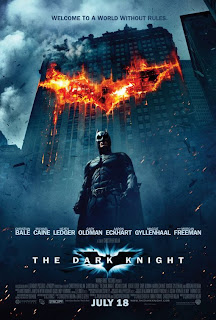
The Dark Knight (Christopher Nolan, 2008) had an estimated budget of $185,000,000 and garnered a gross profit of $1,001,921,825 worldwide. It was also generally well received by critics.
Inception (Christopher Nolan, 2010) had an estimated budget of $160,000,000 and received a gross profit of $820,186,685 worldwide. This film was also very well received by critics.
Finally, ‘Warner Bros.’ most recent film to be released is Sucker Punch (Zack Snyder, 2011) which had an estimated budget of $82,000,000 and has at present earned a gross profit of $29,811,118 in the USA as of 3rd April 2011, just over a week after its release and it is also being released worldwide. While Sucker Punch has not earned the best critical reception, it is a film that I really loved as seen in my review on my website.
While there is no way that my film would be picked up by this major distributor as it is, if it received a decent budget and was produced using all of the professional equipment necessary I believe that it could be as successful as other films distributed by ‘Warner Bros.’
Who would be the audience for your media product?
The target audience of my media product would be your average movie goer, the 18-50 age group. While this may seem like a standard group to aim at, it would most likely attract the largest audience and to make a profit on the movie this would be necessary. Even though the social group that is represented is the 16-22 age bracket, this bracket would remain relevant to the average movie goer. In terms of class the audience would most likely be middle class and would either be in education or in a steady job in the services sector as most of the British public are. Although there is no specific race or religion targeting, the audience would most likely be your standard White British Christian in the UK as those have the highest demographic (White British makes up 85.67% of the population, and 71.6% of the population are Christian) in the UK.
During my audience questionnaire I asked an age group that was masinly between 16 and 50 and because I asked their opinion on all of the important issues so hopefully it should be more targeted towards them.
There is no specific gender targeting purely because there is only a 2% difference between male viewers and female viewers in the research I did earlier in the process. By not targeting any specific gender I am not immediately discouraging a potential market.
Overall, I think that the overtly non-specific nature of the opening’s targeting is what makes it accessible to a much larger audience even if only a niche audience chose to see the film. This would make it a much more economically viable film as far more people will potentially watch it than if it was a very niche title.
How did you attract/address your audience?
My Thriller attracts its audience largely through the enigma code and the stylised visuals. The eerie start with the moon starts the audience on an uncomfortable note but the quietness of this lulls them into a false sense of security so that when the character of Lynette starts to run they are caught by surprise. By starting the movie with a murder the audience will be hooked and have a number of questions that they would stay to have answered. Thriller audiences thrive on enigma codes because it gives them things to think about and forces them to want to understand the film.
The characters, the costumes and the setting are also ways in which I address my audience. All of the characters are within the social group that I wish to represent and as such this would allow the audience to more easily relate to the film and its narrative. The costumes are clothes that the people in this social group would naturally wear and as such would make the film seem more real and therefore more threatening and unsettling. The setting also does this through being in a location that is easily recognisable or linkable to the audience's experience. The genre expectations are something that would easily excite my audience as they would not be disappointed in how many conventions my opening meets and how I have tried to utilise these conventions in as many interesting ways as possible.
The music is another large way in which I attract my audience. The action of the opening quickens and slows in time with the music and adds a certain pace to the situation. Much like the opening of Sucker Punch, the music makes it stand out against most films due to the different nature of the music.
Even though I believe that the opening of Sucker Punch is much more effective than my own, the methodology behind the music is the same.
Audience Evaluation
Stephanie Chawner - "Overall I enjoyed watching the opening scene to this film. There were lots of things that I liked about it. The main things that I like are; the font of the titles as it gives the scary thrilling effect of the thriller, I liked the way that the music has a fast pace to add to the thriller effect and I liked the variety of different shots that it had. If I had to give it improvements I would say that It could be a little too dark as it was sometimes difficult to see the focus of the shots and I think that it developed a little too far into the plot of the film to be an opening scene."
James Thompstone - "The music in midnight is the most effective convention. The music feels like a mixture of crime and action thriller, it complements the dark lit camera and the fast movements, to create a feeling of terror and mystery. The only criticism I would have is that the opening credit sequence is very long and the camera is very dark. I know that sound effects are not in total control so I appreciate the footstep sounds effects they are very good however the gun shot noise sounds unrealistic, it feels faked. I believe that Richard has created a very good piece of thriller media, it is very effective as an opening sequence it doesn’t give anything significant away about the rest of the film and gets you thinking about what is going to happen next creating a good feeling of suspense."
Sophie Kish - "Overall a really good first attempt at a thriller opening, I am really impressed with the edit on the beat of the music, and the way that you use the shots and the music to build tension in the short space of time.
From a media students perspective, if you had the proper software then you could have worked on the 'night time' effect more, because I feel that it is a little too blue, and that really gives the impression it is edited rather than natural lighting, which you really need to aim for with a thriller. The pacing of the edit though works really well, and you get the impression that she is 'scared'.
The second half is well edited, and well paced. My only criticism through no fault but my own is the line "what's the link" as it sounds like the sound has been cut off, I also think that the "eye opening" shot could have been cut a bit shorter, mainly from 1.59 onwards is the better part of the shot.
But saying that, for this opening I am really impressed with the time and effort you put in. It is brilliant. Well Done!"
I am really pleased with all of these evaluations as they prove that I have created a successful opening sequence to a Thriller. There are a few minor errors in the film, but these are only very minor and I have already noticed most of these errors.
What have you learnt about technologies from the process of constructing this product?
Throughout this task I have learnt a lot about the technologies I need to use to construct such a product. One major thing that I have learnt is my control of my camera. Before the project I knew next to nothing about its features and what they did, but now, I know that I have to get the white balance right for the scene but I also have to make sure that the metering mode is correct and that it is saving the film in the correct size and quality.
I have also learnt that I am much more proficient in using Sony Vegas than I am with Adobe Premiere Pro and Adobe After Effects because I was able to accomplish everything in Sony Vegas without a problem. This is in comparison to my massive struggles with understanding Premiere Pro and After Effects in its needlessly complex interface. While this may suggest that I was too impatient with the software, I honestly believe that I have created a superior product with the software I am more comfortable with and this proves that it was a good idea for me to use my software. It also meant that I had more time to work on my project as I was not confined to the hours spent in the lessons. I also believe that I have benefited greatly from this extra time as it has allowed me to add the extra polish to my project. Even then, I have become even better at using Sony Vegas, using more effects than I have on any other project I have done on the program. I learnt a lot about curves and brightness and contrast settings when I was trying to achieve the Day for Night effect and although I do not believe that I have perfected the skill of it, it is certainly better than my dismal attempt on After Effects.
In the end I had one video track, two text tracks and 2 audio tracks. One audio track was for the score that was created by James Cooper and the other was for the few sound effects and pieces of dialogue. The reason for the existence of two text tracks is the ‘Starring’ and ‘Featuring’ credits which required two parts to make.
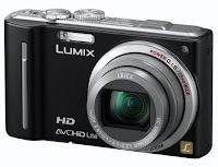
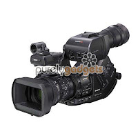
I have also learned about the drawbacks of creating a film without a budget. The lack of a dolly made my running sequence incredibly shaky and even though this is effective it is potentially less professional looking in comparison to the still tripod captured shots. Also, my lack of a professional camcorder and boom microphone (Something I would never be able to afford as they cost £1000 upwards with one costing £8000(The Camcorder)) has led to small issues with the audio and overall cinematic quality of my film. Although my camera, the Panasonic Lumix TZ10, can record in HD and the quality is good, it does not have the same power or sheen of professional equipment. For what I had, I am incredibly proud of what I have created and although it is not a 100% professional film it is probably as professional as I can get it without a full feature film budget.
Looking back at your preliminary task, what do you feel you have learnt in the progression from it to the full product?
From my preliminary task to my thriller project, I feel as if I have not progressed as far as most people in my Media group in my skills purely because I was already capable of using editing software and filming when I started the course. Despite this, I do feel as if I have progressed in learning the nuances of filming and editing and honing my skills.
When I worked on the preliminary task I had an idea and I went with it even though it was not a perfect idea. I also thought that I would be able to film things that in the end I was not able to do. During the shot where Frankie’s character walks towards the door, I thought that I would be able to get more of the background in the shot but when it came to shooting this turned out to be impossible and I had to improvise to get a decent shot. I also did not notice that I was going to have to break the 180° rule and it was too late to rectify it when it came to filming.
Earlier in the project I watched a number of other Thrillers and discussed the conventions that they seemed to portray. These included:
• Very simple and quick cuts.
• Takes that are either incredibly long or rather short
• A soundtrack that uses a lot of strings to be eerie, melancholy or epic. Sometimes heavy bass and percussion is used
• Lighting that is used to create incredibly clever shadows. Where shadow is not used, there is usually no lighting to create an incredibly dark scene.
• A setting that is recognisable to the audience.
• A narrative enigma and often have multiple plot twists throughout the movie to keep the audience thinking.
• A crime or something similar around which the narrative can centre itself.
• The theme of victims and villains. Villains are a major force within Thrillers and are usually the main driving force behind the narrative. They are always known to exist, but their true identity or their motive is sometimes hidden from the audience's knowledge until later in the film. The victims are either minor characters whose only role in the movie is their death or they are the protagonist/protagonists as they attempt to escape the villain.
Transitions
After developing my own Thriller I believe that I have used all of these conventions to the best if my abilities. All of the cuts in my movie are incredibly simple and there is at most, one fade. All of these transitions occur incredibly quickly and this is used to add a certain pace to the film to make it more thrilling.
Shot Length
Throughout my opening sequence I do use a variety of shot lengths ranging from the first thirty second shot to the two one second shots at the end of the running sequence.
Lighting
The lighting conventions were interesting as all of my shots were filmed outside. This meant that all lighting was out of my control; however, in the editing stage I made the first sequence appear like it takes place in the middle of the night and the second sequence is darkened to create a stylised look. This miraculously made it match the convention and I am glad that it did because it really adds to the dark tone of the opening.
Setting
The setting of the Thriller is a suburban road and a person’s driveway, both are recognisable to audiences and this brings the sinister nature of the Thriller closer to them.
Narrative Enigma
There are also a number of narrative enigmas in my Thriller that are already hinted at in the opening. First is the question of who the murdered girl is and why she is standing in the middle of the road, then there are questions about who the murderer is and why he is on a murder spree? Finally there are questions about who the protagonist is and what she is doing.
Crime
There is also a crime, a series of murders, that the narrative can centre itself around.
Theme
Finally the theme of victims and villains is also apparent in my opening. Whilst it is not necessarily explicit, it should be obvious to the audience that the murderer is the villain and that the character of Lynette James is a victim.
Even though all of these conventions are met, I cannot say that I aimed to meet all of them. My goal was to make the opening two minutes of a Thriller movie, so I did not need to meet all of them. Also, if it were better for the film to not meet some of the conventions then I would have done so. Even though this is the case, I am glad that I have met all of the conventions that I noticed in both Silence of the Lambs and Memento. One comparison I can make is to The Bourne Identity (Doug Liman, 2002). This also opens in the middle of the night (As seen in the above image) but also places a character in a very unlikely situation as one use of the enigma code. The simple cutting during the running sequence is also similar to that in Silence of the Lambs.
How does your media product represent particular social groups?
My Thriller is meant to represent the young adult age group and as such, all of the characters in my opening sequence are of that age range. The 16-22 year old age range is one that I feel most comfortable in representing as it is the one that I belong to but it is also one that is frequently seen in the news for numerous atrocities. These are mainly stabbings, but there have been some shootings in recent years. This makes for an interesting study as in my film I can portray my view on our age bracket and try to prove that while a very small minority of youths are violent and cruel, the majority of youths are victims to these attacks.
The protagonist of the film is Zoe Moon, a 21 year old Journalism graduate, who is played by Sophie Kish. Sophie is a 21 year old Media Performance student at Glamorgan University and is in her last year and is graduating on the 5th July 2011. This makes her the perfect age and actress for the part as she is closely able to understand the mentality of the character. In the opening, the character of Zoe is dressed in a red shirt, black cardigan and a black skirt although only her top half is seen from inside the car. The red and the black hint at danger, either from her or for her, and they really make her character seem passionate and forceful. The thick-rimmed glasses make the character seem intelligent and suggests that she will eventually figure out the puzzle, they also hint at a clarity of vision that some of the other characters would not have. Overall, this is a really positive representation of the social group as it depicts them to be hard working, bright and very clear minded.
The character of Lynette James is played by Katie Hutchinson, both are 17 year old A-Level students and both have a kind hearted disposition. The character of Lynette is meant to be seen as a victim from the start of the opening to the moment of her murder and this is largely achieved through framing and camera angles. Almost all of the shots of Lynette are mainly filled with background with the character taking up a very small portion of the screen. This makes her look incredibly vulnerable and this is majorly exacerbated in the canted angle in which the villain walks in from screen left. Even though the shot is low angle, the leg of the villain is much larger than the character and this makes her look really weak and in a lot of danger. There are some hints at purity in the character, largely through her costume. The cream coat is the major indicator of this through the connotations of the colour, but the blue scarf adds a certain melancholy to the character through its connotations. Also, the flowing nature of the scarf and by having her hair down adds a certain elegant nature to the character which also adds to the positive image that I am trying to represent.
The villain of the piece, Midnight, is portrayed by Martin Smith. Although only his leg is seen, due to the darkness of the screen, the leg seems so much more imposing. As it is the closest thing to the screen at the time this further adds to the sinister nature of the character. Even though this is about the closest analysis that can be made of the character from the opening sequence, it does show a negative representation of the social group and its violence.
By having two positive representations versus one small negative representation I believe that I am successful in my task of proving that only a small minority of the social group are violent. While this group is never really discussed in film in this manner, it is something that I think would resonate with my audience and would hopefully educate older members of society.
What kind of media institution might distribute your media product and why?
Due to the location and budget of my movie, it would most likely be distributed by an independent film organisation like ‘Warp Films’ who were behind the thriller Dead Man’s Shoes (Shane Meadows, 2004). Most of the companies films are low budget, thought provoking films that have a British feel to them and this is something that I feel my film also does.
However, were my film to have a larger budget I would definitely want for it to be distributed by much larger companies like ‘Warner Bros. Pictures’, ‘Fox Searchlight Pictures’ and ‘Universal Pictures’. This is because these companies have major control over marketing and distribution and would be able to get my film seen by far more people than ‘Warp Films’ could ever hope to reach.
These companies might be interested in my film because of its engaging narrative and interesting character types that an audience could relate to. I also believe that the cinematography and stylised nature might appeal to them, especially considering they have distributed similar films.
Specifically, I would love for ‘Warner Bros. Pictures’ to distribute my film as they have simultaneously distributed some of the highest grossing Thriller films of all time, but they have also distributed films that I love and that I believe link nicely to my own.
The Dark Knight (Christopher Nolan, 2008) had an estimated budget of $185,000,000 and garnered a gross profit of $1,001,921,825 worldwide. It was also generally well received by critics.
Inception (Christopher Nolan, 2010) had an estimated budget of $160,000,000 and received a gross profit of $820,186,685 worldwide. This film was also very well received by critics.
Finally, ‘Warner Bros.’ most recent film to be released is Sucker Punch (Zack Snyder, 2011) which had an estimated budget of $82,000,000 and has at present earned a gross profit of $29,811,118 in the USA as of 3rd April 2011, just over a week after its release and it is also being released worldwide. While Sucker Punch has not earned the best critical reception, it is a film that I really loved as seen in my review on my website.
While there is no way that my film would be picked up by this major distributor as it is, if it received a decent budget and was produced using all of the professional equipment necessary I believe that it could be as successful as other films distributed by ‘Warner Bros.’
Who would be the audience for your media product?
The target audience of my media product would be your average movie goer, the 18-50 age group. While this may seem like a standard group to aim at, it would most likely attract the largest audience and to make a profit on the movie this would be necessary. Even though the social group that is represented is the 16-22 age bracket, this bracket would remain relevant to the average movie goer. In terms of class the audience would most likely be middle class and would either be in education or in a steady job in the services sector as most of the British public are. Although there is no specific race or religion targeting, the audience would most likely be your standard White British Christian in the UK as those have the highest demographic (White British makes up 85.67% of the population, and 71.6% of the population are Christian) in the UK.
During my audience questionnaire I asked an age group that was masinly between 16 and 50 and because I asked their opinion on all of the important issues so hopefully it should be more targeted towards them.
There is no specific gender targeting purely because there is only a 2% difference between male viewers and female viewers in the research I did earlier in the process. By not targeting any specific gender I am not immediately discouraging a potential market.
Overall, I think that the overtly non-specific nature of the opening’s targeting is what makes it accessible to a much larger audience even if only a niche audience chose to see the film. This would make it a much more economically viable film as far more people will potentially watch it than if it was a very niche title.
How did you attract/address your audience?
My Thriller attracts its audience largely through the enigma code and the stylised visuals. The eerie start with the moon starts the audience on an uncomfortable note but the quietness of this lulls them into a false sense of security so that when the character of Lynette starts to run they are caught by surprise. By starting the movie with a murder the audience will be hooked and have a number of questions that they would stay to have answered. Thriller audiences thrive on enigma codes because it gives them things to think about and forces them to want to understand the film.
The characters, the costumes and the setting are also ways in which I address my audience. All of the characters are within the social group that I wish to represent and as such this would allow the audience to more easily relate to the film and its narrative. The costumes are clothes that the people in this social group would naturally wear and as such would make the film seem more real and therefore more threatening and unsettling. The setting also does this through being in a location that is easily recognisable or linkable to the audience's experience. The genre expectations are something that would easily excite my audience as they would not be disappointed in how many conventions my opening meets and how I have tried to utilise these conventions in as many interesting ways as possible.
The music is another large way in which I attract my audience. The action of the opening quickens and slows in time with the music and adds a certain pace to the situation. Much like the opening of Sucker Punch, the music makes it stand out against most films due to the different nature of the music.
Even though I believe that the opening of Sucker Punch is much more effective than my own, the methodology behind the music is the same.
Audience Evaluation
Stephanie Chawner - "Overall I enjoyed watching the opening scene to this film. There were lots of things that I liked about it. The main things that I like are; the font of the titles as it gives the scary thrilling effect of the thriller, I liked the way that the music has a fast pace to add to the thriller effect and I liked the variety of different shots that it had. If I had to give it improvements I would say that It could be a little too dark as it was sometimes difficult to see the focus of the shots and I think that it developed a little too far into the plot of the film to be an opening scene."
James Thompstone - "The music in midnight is the most effective convention. The music feels like a mixture of crime and action thriller, it complements the dark lit camera and the fast movements, to create a feeling of terror and mystery. The only criticism I would have is that the opening credit sequence is very long and the camera is very dark. I know that sound effects are not in total control so I appreciate the footstep sounds effects they are very good however the gun shot noise sounds unrealistic, it feels faked. I believe that Richard has created a very good piece of thriller media, it is very effective as an opening sequence it doesn’t give anything significant away about the rest of the film and gets you thinking about what is going to happen next creating a good feeling of suspense."
Sophie Kish - "Overall a really good first attempt at a thriller opening, I am really impressed with the edit on the beat of the music, and the way that you use the shots and the music to build tension in the short space of time.
From a media students perspective, if you had the proper software then you could have worked on the 'night time' effect more, because I feel that it is a little too blue, and that really gives the impression it is edited rather than natural lighting, which you really need to aim for with a thriller. The pacing of the edit though works really well, and you get the impression that she is 'scared'.
The second half is well edited, and well paced. My only criticism through no fault but my own is the line "what's the link" as it sounds like the sound has been cut off, I also think that the "eye opening" shot could have been cut a bit shorter, mainly from 1.59 onwards is the better part of the shot.
But saying that, for this opening I am really impressed with the time and effort you put in. It is brilliant. Well Done!"
I am really pleased with all of these evaluations as they prove that I have created a successful opening sequence to a Thriller. There are a few minor errors in the film, but these are only very minor and I have already noticed most of these errors.
What have you learnt about technologies from the process of constructing this product?
Throughout this task I have learnt a lot about the technologies I need to use to construct such a product. One major thing that I have learnt is my control of my camera. Before the project I knew next to nothing about its features and what they did, but now, I know that I have to get the white balance right for the scene but I also have to make sure that the metering mode is correct and that it is saving the film in the correct size and quality.
I have also learnt that I am much more proficient in using Sony Vegas than I am with Adobe Premiere Pro and Adobe After Effects because I was able to accomplish everything in Sony Vegas without a problem. This is in comparison to my massive struggles with understanding Premiere Pro and After Effects in its needlessly complex interface. While this may suggest that I was too impatient with the software, I honestly believe that I have created a superior product with the software I am more comfortable with and this proves that it was a good idea for me to use my software. It also meant that I had more time to work on my project as I was not confined to the hours spent in the lessons. I also believe that I have benefited greatly from this extra time as it has allowed me to add the extra polish to my project. Even then, I have become even better at using Sony Vegas, using more effects than I have on any other project I have done on the program. I learnt a lot about curves and brightness and contrast settings when I was trying to achieve the Day for Night effect and although I do not believe that I have perfected the skill of it, it is certainly better than my dismal attempt on After Effects.
In the end I had one video track, two text tracks and 2 audio tracks. One audio track was for the score that was created by James Cooper and the other was for the few sound effects and pieces of dialogue. The reason for the existence of two text tracks is the ‘Starring’ and ‘Featuring’ credits which required two parts to make.


I have also learned about the drawbacks of creating a film without a budget. The lack of a dolly made my running sequence incredibly shaky and even though this is effective it is potentially less professional looking in comparison to the still tripod captured shots. Also, my lack of a professional camcorder and boom microphone (Something I would never be able to afford as they cost £1000 upwards with one costing £8000(The Camcorder)) has led to small issues with the audio and overall cinematic quality of my film. Although my camera, the Panasonic Lumix TZ10, can record in HD and the quality is good, it does not have the same power or sheen of professional equipment. For what I had, I am incredibly proud of what I have created and although it is not a 100% professional film it is probably as professional as I can get it without a full feature film budget.
Looking back at your preliminary task, what do you feel you have learnt in the progression from it to the full product?
From my preliminary task to my thriller project, I feel as if I have not progressed as far as most people in my Media group in my skills purely because I was already capable of using editing software and filming when I started the course. Despite this, I do feel as if I have progressed in learning the nuances of filming and editing and honing my skills.
When I worked on the preliminary task I had an idea and I went with it even though it was not a perfect idea. I also thought that I would be able to film things that in the end I was not able to do. During the shot where Frankie’s character walks towards the door, I thought that I would be able to get more of the background in the shot but when it came to shooting this turned out to be impossible and I had to improvise to get a decent shot. I also did not notice that I was going to have to break the 180° rule and it was too late to rectify it when it came to filming.
In my Thriller I made sure to really carefully plan my storyboard and I thought of how I was going to get the shots I needed and whether they were possible. I also made sure to figure out how effective the shots would look before I even got to the shoot. This meant that I was more efficient in getting the shots than in the preliminary task. To keep confusion to a minimum in my opening I thought it was paramount to abide by the 180° rule and I believe that I have done this successfully. While some shots in the second sequence do slightly break the rule the change is not noticeable and it is certainly nowhere near as bad as the break in my preliminary task.
I believe that my framing and my composition of my shots has improved. In my Preliminary Task, the shots were not particularly well framed and were filled with pointless and distracting objects in the background. In my Thriller, almost everything was placed in the shots to show something important or to suggest normality. The framing was also remarkably better because a certain dynamic quality was created from this.
I believe that my framing and my composition of my shots has improved. In my Preliminary Task, the shots were not particularly well framed and were filled with pointless and distracting objects in the background. In my Thriller, almost everything was placed in the shots to show something important or to suggest normality. The framing was also remarkably better because a certain dynamic quality was created from this.


I have also learnt a number of things about shooting that I did not know before and were actually incredibly important in getting good shots. One is that it is impossible to shoot anything during dusk as time runs out too quickly and then you cannot film anything because it is too dark.
Also, if you are filming on a road, try and get it closed off so that you are not interrupted during filming. While I was unable to do this, I had enough time to get all of the shots. Still, I would have gotten those shots quicker without the interruptions.
Also, if you are filming on a road, try and get it closed off so that you are not interrupted during filming. While I was unable to do this, I had enough time to get all of the shots. Still, I would have gotten those shots quicker without the interruptions.
Overall, I do feel as if I have progressed somewhat in my ability to produce a high quality film as I have now learned certain nuances in planning, filming and editing, but I do not feel as if my skills have made a spectacular progression as my learning curve was far shallower than the other candidates in my class. This is largely because I have never come across an issue that fazed me throughout the project and my cinematic vision translated perfectly from my mind to the shots and finally to the screen. However, because I have honed my skills and learnt a couple of tricks I believe that I will definitely be able to make increasingly better products as I continue through the course.


